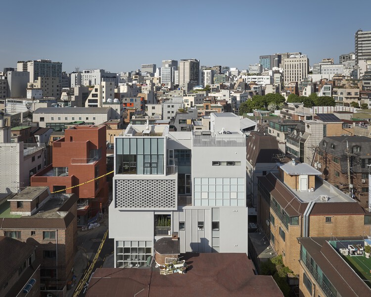


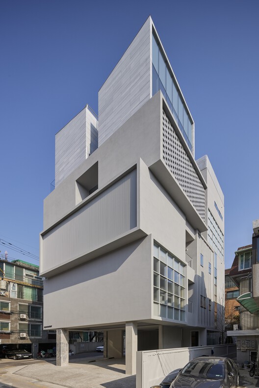
Collective overview – Supermarket Creative is the name of the advertising company that commissioned us to design this office project. The four young partners founded their business and named it so as a reflection of their commitment to fulfill every request from customers in a multifaceted way. They also aim to be flexible and accessible in what they do and where customers can find what they are looking for. They asked us to design their first office building in a way that reflects this approach. The project began with the issue of designing an office that is, in essence, a supermarket.
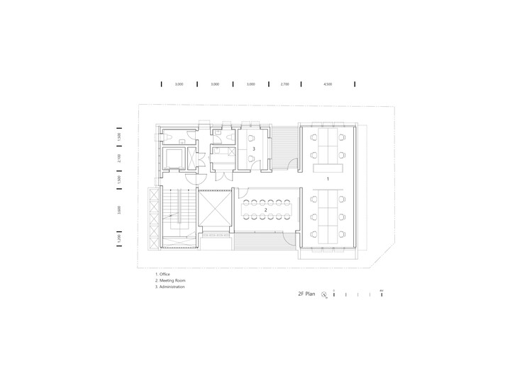
Supermarkets are some of the most popular spaces in our everyday life, where we can buy various things we need. They are also a projection of people’s ever-evolving lifestyles, which prompt them to continue to reshape themselves in response to changing needs. Therefore, they are mutable rather than fixed spaces. How would we convey this understanding in our architecture? How would we design the context of the city that would house our structure to create diversity? How would we make this space flexible and evolve over time? These were the questions we asked ourselves when we started working on the project.
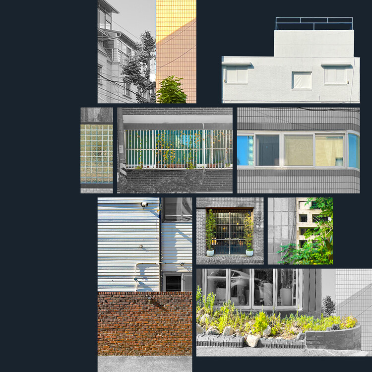
Collective models – From fragmentary images to collaged images – A city is an artificial environment created by people at their discretion. It continues to evolve in response to developments in situations and environments, creating landscapes by superimposing collective patterns. Our objective was to create strange yet familiar images by combining these fragmentary images of the city. Identifying patterns created by temporal and environmental flows, which are often ignored or left unrecognized, is a way to provide new meanings and determine relationships with their surroundings. These new combinations of familiar patterns create familiar yet quirky looks that will encourage people to see existing patterns in a new light. This is how we give meaning to this building as a tool for fostering relationships in the context of the city.
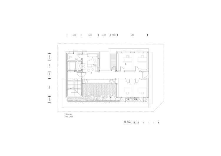
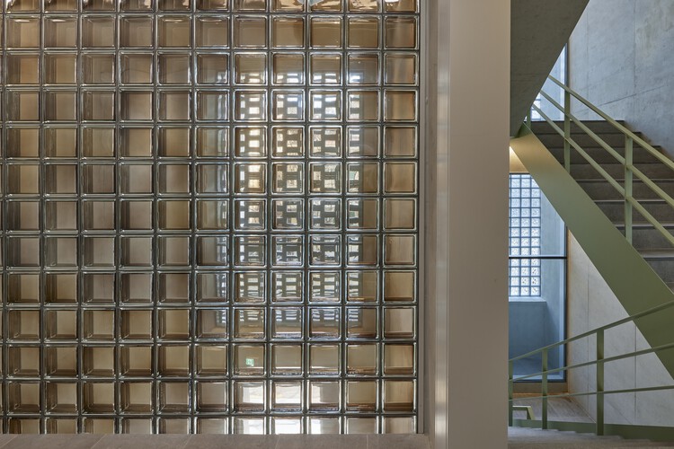
Patterns in the urban context are regular forms and constitute a unit of the city. We abstracted these forms into purely sculptural elements and displayed them to highlight the different aspects of the site. Existing models are recreated through different materials and changes in scale to envision unfamiliar images, which in turn allow people to recognize things they did not know. The building now finds its raison d’être as collaged images showing many aspects of the city. We used different images from our surroundings, including old bricks and materials, unconceived nature and traces of time created by the accumulation of different physical properties, to reinterpret the image of the supermarket, a collection of different things, giving value as an archive and repository of context.
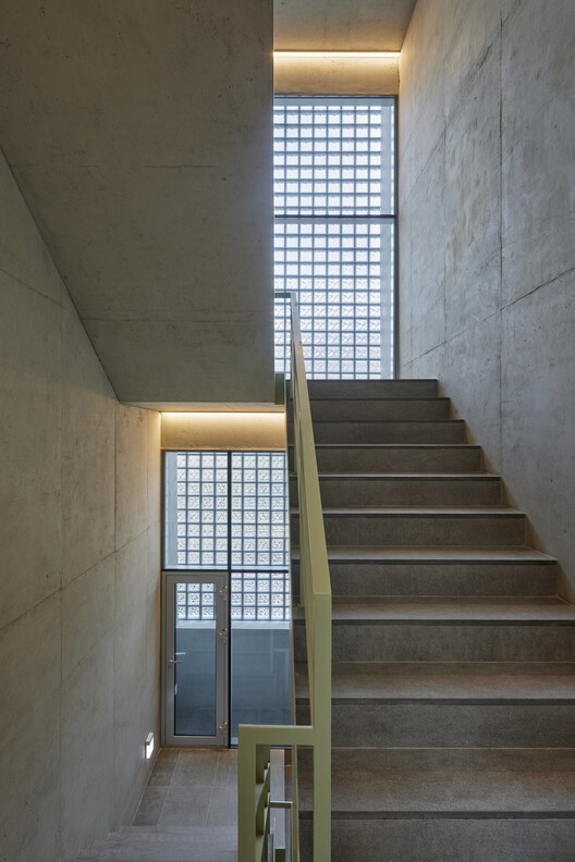
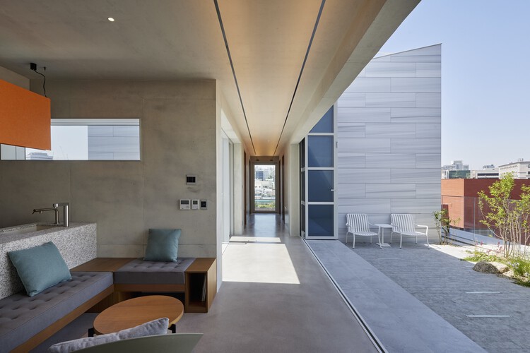
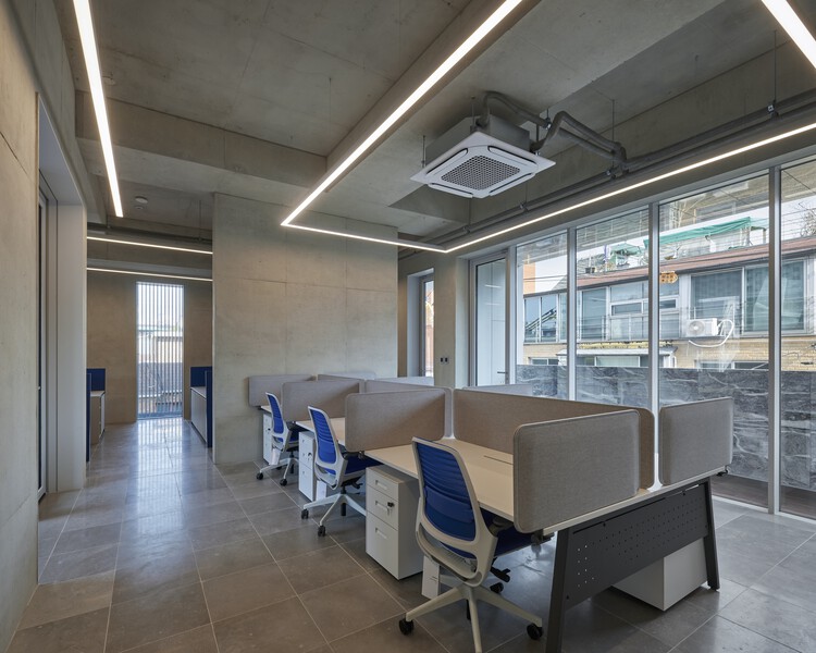
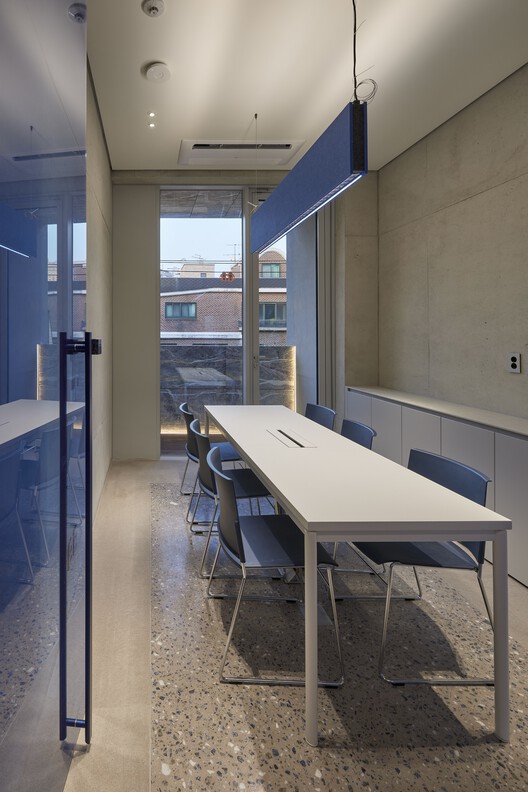
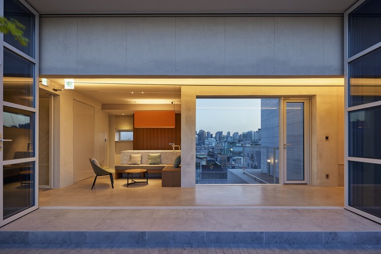
Conscious and colorful space + Garden – Our objective was to blur the boundary between outdoor and indoor spaces by extending different patterns and materials from the outside to the inside of the building. This would further extend the physical boundary of the building, allowing people to experience the building as an extension of space. Colors were used on each floor to make the color of the space tangible to people. Bringing changes to the monotonous and homogenous concrete space, colors serve as a means to evoke different emotions.
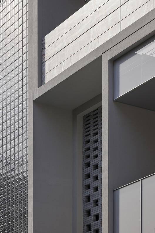
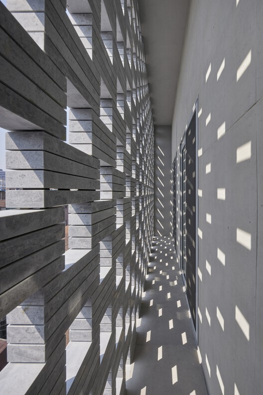
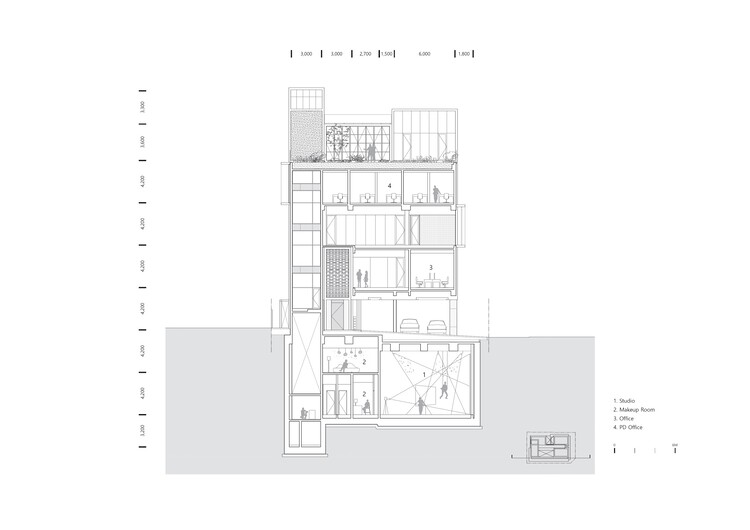
The garden spaces on each floor were intended to provide a tactile experience of the changes in the building over time and the changes in the seasons. This addresses the common perception that buildings are fixed and unresponsive to their surroundings. In contrast to the homogenization and uniformity of building spaces in urban environments, materials from nature celebrate colors that change over time, offering a variety of ways to stimulate creativity and elicit different emotions.
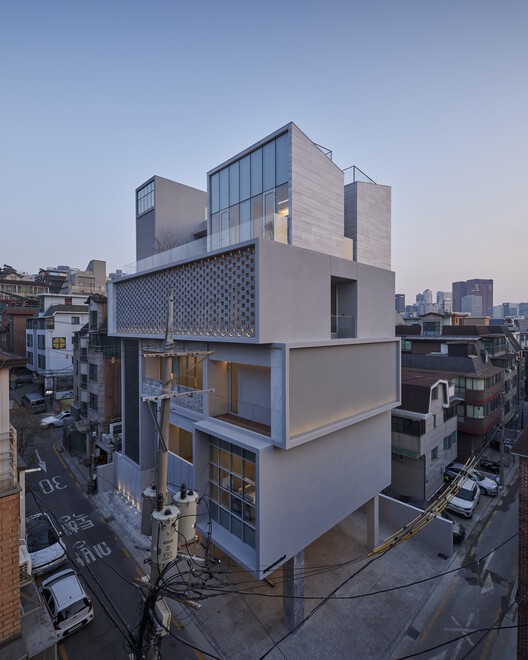
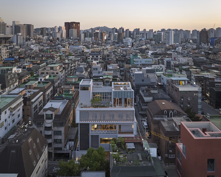
The start of the project prompted thoughts about the urban context, potentially in line with the client’s ideas and expectations. The diversity and flexibility of the supermarket will have a significant impact on the public interest by exceeding the goals and expectations of the client and the architect and by interacting with those who use and experience the space, the communities around it and society at large.
#Collective #mirror #office #building #SEED #house
Image Source : www.archdaily.com
